Where it lives
Open Reports → Orders, set your filters and date range, and look at the Analytics panel. AI Insights sits at the top; click Generate to produce the analysis for exactly the data on screen.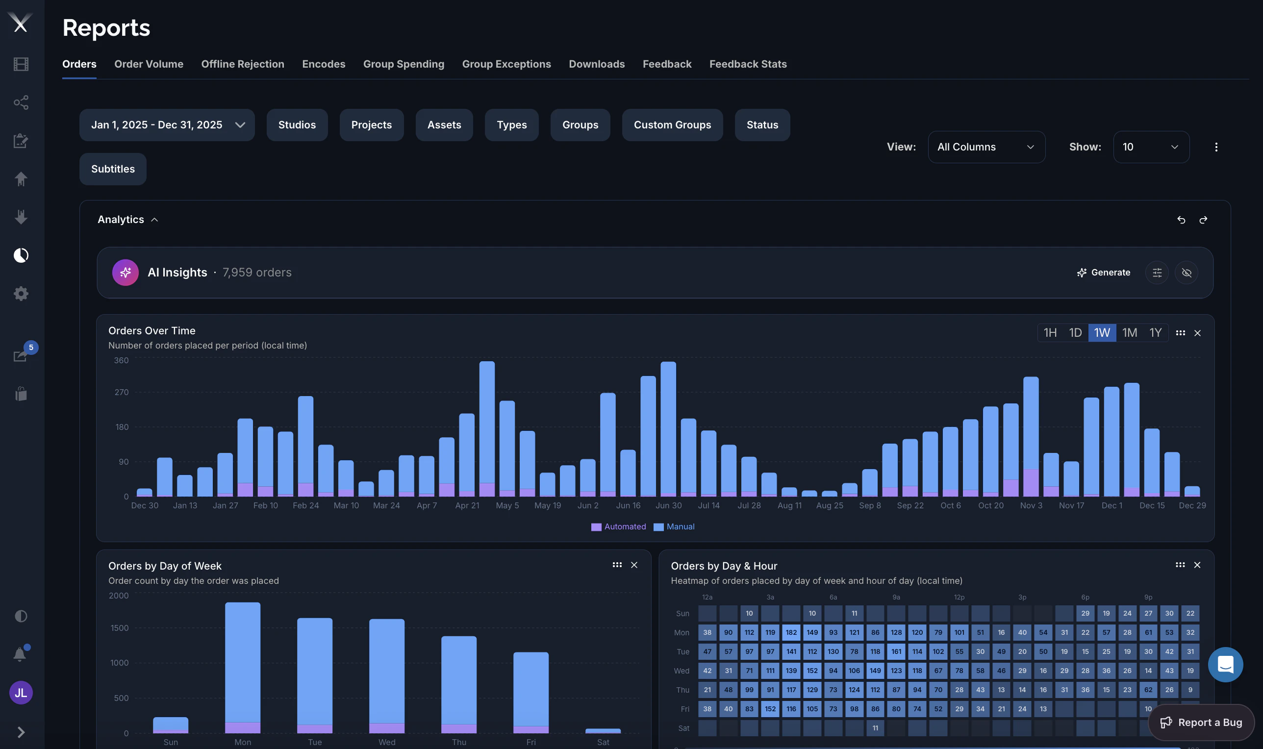
How it works
When you press Generate, Pixwel’s system analyzes a snapshot of the report you’re viewing and streams back the findings:- It only sees your filtered, aggregated report. The same totals and breakdowns the charts are built from — orders over time, and counts by studio, status, stage, language, type, group, and country, plus your top projects and assets. It reflects the filters and date range you’ve set; change them and regenerate to analyze a different slice.
- It analyzes, then ranks. The agent looks for the trends, bottlenecks, and outliers that matter, then returns only the 2–3 most actionable — not a long list.
- It returns structured cards. Each insight comes back as a compact card, not a wall of text.
AI Insights works from the aggregated numbers in your report — the same figures the charts show. It isn’t given free rein over the database, and it can’t see data your account can’t.
What an insight looks like
Every insight follows the same shape:- Headline with the number — the finding, led by the figure that makes it (e.g. “Orders up 38%, concentrated in FR and GER”).
- Driver — one sentence on why it’s happening (“driven by…”, “concentrated in…”).
- Action — one concrete next step (investigate, reassign, renegotiate, open capacity, update the brief).
- Severity — high / medium / low, so the urgent ones stand out.
- Optionally a standout metric and short evidence or caveats, included only when they change the decision.
Tailor the analysis
Set your role
Tell it who’s reading so it calibrates depth:
- Executive — takeaways and dollars; budget exposure and territory risk, in a sentence or two.
- Operations — operational specifics: which order, vendor, stage, or asset is the bottleneck.
- Analyst — the data itself, precise, with drill-down paths.
Add standing instructions
Save persistent directions (your priorities, vocabulary, preferred depth) and the agent applies them to every analysis — for example “always quantify in EUR” or “focus on vendor turnaround.”
Why you can trust the numbers
The agent runs under strict rules designed to keep it honest:- It never invents data. Every number in the output comes from your report — no estimated order counts, dollar figures, vendor names, or dates.
- It does no mental math and won’t “round to make a point land.”
- It says “insufficient data” and stops rather than guessing when the report can’t support a claim.
- Every number carries a comparison (vs. the prior period, a peer territory or vendor, or the SLA target) and states the window — “up 22%” is never left to mean nothing.
- It flags small samples as directional rather than presenting them as firm.
Limits
- It only knows your report. It won’t pull in outside industry knowledge or data beyond what’s in the current view.
- Time-to-money needs cost data. If your report doesn’t include cost figures, it quantifies the time impact and stops short of the dollar impact.
- Small samples are directional. A pattern over a few dozen orders is flagged as such.
- Today it analyzes the Orders report; other reports may follow.